Civil Rights
1. There is quite a bit of good news for civil rights. First, National Security Letters--which the federal government uses to get personal information on thousands of Americans from companies like Google--have been ruled unconstitutional. What made NSLs particularly disturbing was that the recipient companies were forbidden from ever acknowledging that they had given the government any information. Thankfully, these gag orders have also been ruled unconstitutional.
2. Second, the Supreme Court limited the use of sniffer dogs and expanded the Fourth Amendment's protection of the home by declaring that porches count as part of the home.
3. There's good news for civil rights in Canada as well. The Supreme Court there recently ruled that police need special wiretapping orders, not just ordinary search warrants, to intercept text messages.
Deficit & Spending
4. Via PostLibertarian, the federal deficit for the first six months of fiscal 2013 is 23% lower than the deficit for the same period in fiscal 2012. Government spending in March 2013 was more than 20% lower than in March 2012, a $76 billion fall from $369 to $293 billion. Moreover, an analysis of four major budget plans (President Obama's, Senate Democrats', House Republicans' and Senator Rand Paul's) shows that all four cut spending over the next ten years relative to the current-law baseline. The coming debate won't be whether or not to cut spending, it will be how much.
Energy & Climate
5. In November 2012, U.S. oil production surpassed that of Saudi Arabia! U.S. oil production also remained higher than Saudi Arabia's in December 2012. While month-to-month production fluctuates, and there may again be months where the Saudis produce more oil than we do, for at least two months in 2012, the United States was the largest oil producer in the world. U.S. oil production has continued to grow since then, and is now more than 7.2 million barrels per day, a level not seen since July 1992. Also in December, another country (China) imported more oil than the U.S. for the first time in four decades (ht).
6. Coral reefs are more resilient than we thought. Reefs damaged in super-hot 1998 were presumed to have little chance of recovery, yet they're recovering nonetheless.
Health
7. A new Bluetooth-enabled implant (ht) can monitor blood levels of up to five chemicals and transmit that data to a smartphone or tablet (and from there to the internet) in realtime. It can currently detect glucose (useful for diabetics), troponin (which is released during a heart attack) and a few other substances, but the device has been designed to accommodate sensors for substances not yet covered.
8. Functioning kidneys can now be grown in a lab, at least for rats. Doing the same with human kidneys will take some time, and even then the lab-grown versions are only 5% as efficient as natural, healthy kidneys. But if your natural kidneys aren't healthy, 5% could be enough of an improvement to be worth the transplant. No doubt researchers will also be working on improving that efficiency as well.
Poverty
9. Two recent studies, one from Oxford University and the other from the UN, highlight the improving conditions of the world's poor (ht via @LDoren). Many of the world's poorest nations are on track to eliminate acute poverty and growth is lifting hundreds of millions out of poverty. From the UN report: "Never in history have the living conditions and prospects of so many people changed so dramatically and so fast."
Other Optimists
10. Ezra Klein (ht MR) has his own list of reasons for optimism. Among others, he lists the slowing rise of health care costs, a turnaround in housing, corporate profits, natural gas and technological advances.
11. Stephan Kinsella (ht Bob Murphy) says, "The Golden Age of America is Now." Kinsella writes from a libertarian viewpoint, and therefore includes items like imminent marijuana legalization that some might not agree are actually good things. But many of his points cut across ideologies--there is no draft, air travel is safer and cheaper than ever and technology is amazing, from cell phones to the internet to 3D printing to private spaceflight. He also cites increased diversity and tolerance, saying, "some people are vegetarians, vegans; no big deal... Some people have nose rings, multiple earrings. Tattoos. Nobody cares... Mixed-race couples? Nobody bats an eye."
Showing posts with label budget deficit. Show all posts
Showing posts with label budget deficit. Show all posts
Thursday, April 18, 2013
Wednesday, December 26, 2012
How Accurate is the CBO?
Politicians and pundits often talk about budget projections from the CBO. Depending on how the CBO's projections mesh with the commenter's worldview, the projections are either the best possible from the nation's top budget economists, or they're crap, constrained by Congressional rules until they're useless. So just how accurate is the CBO?
A comment over at Bob Murphy's Free Advice inspired me to check out both the 2001 and 2012 "Budget and Economic Outlook" reports from the CBO. While I've got them out, I thought it'd be interesting to compare the CBO's old projections with what actually happened. Conveniently, the 2001 and 2012 reports overlap in 2011, so that's the year I'll compare.
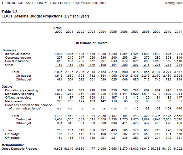
First, Table 1-2 from the 2001 report (page 24 of the PDF), including the 2001 projection for 2011 in the far-right column:
Then, Table 1 from the 2012 report (page 6 of the PDF), including the actual numbers for 2011 in the far-left column:

How accurate was the CBO for 2011? Not at all.
Revenue: The CBO projected revenues of $3.4 trillion, while actual revenues were a full third lower than the projection, at $2.3 trillion.
Outlays: The CBO projected outlays of $2.6 trillion, while actual outlays were a full trillion higher at $3.6 trillion.
Deficit: The CBO optimistically projected an $889 billion surplus for 2011. The actual deficit was $1.3 trillion, a $2.2 trillion difference. (Of course, this error is just the combination of the two errors above. Still, it's interesting to contemplate a United States with an $889 billion surplus!)
GDP: The CBO projected a $16.9 trillion (nominal) GDP, but actual GDP was only $15.3 trillion.
Should we just write off the CBO entirely then? I don't think so. On the revenue side, the CBO could not have accounted for the Bush tax cuts or the revenue lost from the Great Recession. On the spending side, they could not have accounted for the war spending or, again, for the Great Recession, or for Obama keeping stimulus-level spending even after the stimulus was over.
I think the takeaway here, as we approach the end of the fiscal cliff negotiations, is that all projections for a decade in the future need to be taken with a grain of salt. Stuff is going to happen that no one expects. Decide for yourself what that should mean for current policy.
A final note: Some might look at the four areas above and say that in each area, the projections ended up being more optimistic than reality. I think that's a mistake. First, the CBO projected in 2001 that 20% of 2011's GDP would be soaked up by federal taxes, when it was actually only 15%. I think that's a good thing, despite what it means for the deficit.
Second, the GDP numbers above are nominal, meaning they include both real GDP and inflation. If nominal GDP is lower than expected, the cause might be lower real GDP (bad) or lower inflation (good). We've had both in recent years, so I'd have to dig deeper into the reports to see which effect dominates, and that's more playing with PDFs than I'd like to do tonight.
A comment over at Bob Murphy's Free Advice inspired me to check out both the 2001 and 2012 "Budget and Economic Outlook" reports from the CBO. While I've got them out, I thought it'd be interesting to compare the CBO's old projections with what actually happened. Conveniently, the 2001 and 2012 reports overlap in 2011, so that's the year I'll compare.
First, Table 1-2 from the 2001 report (page 24 of the PDF), including the 2001 projection for 2011 in the far-right column:
Then, Table 1 from the 2012 report (page 6 of the PDF), including the actual numbers for 2011 in the far-left column:
How accurate was the CBO for 2011? Not at all.
Revenue: The CBO projected revenues of $3.4 trillion, while actual revenues were a full third lower than the projection, at $2.3 trillion.
Outlays: The CBO projected outlays of $2.6 trillion, while actual outlays were a full trillion higher at $3.6 trillion.
Deficit: The CBO optimistically projected an $889 billion surplus for 2011. The actual deficit was $1.3 trillion, a $2.2 trillion difference. (Of course, this error is just the combination of the two errors above. Still, it's interesting to contemplate a United States with an $889 billion surplus!)
GDP: The CBO projected a $16.9 trillion (nominal) GDP, but actual GDP was only $15.3 trillion.
Should we just write off the CBO entirely then? I don't think so. On the revenue side, the CBO could not have accounted for the Bush tax cuts or the revenue lost from the Great Recession. On the spending side, they could not have accounted for the war spending or, again, for the Great Recession, or for Obama keeping stimulus-level spending even after the stimulus was over.
I think the takeaway here, as we approach the end of the fiscal cliff negotiations, is that all projections for a decade in the future need to be taken with a grain of salt. Stuff is going to happen that no one expects. Decide for yourself what that should mean for current policy.
A final note: Some might look at the four areas above and say that in each area, the projections ended up being more optimistic than reality. I think that's a mistake. First, the CBO projected in 2001 that 20% of 2011's GDP would be soaked up by federal taxes, when it was actually only 15%. I think that's a good thing, despite what it means for the deficit.
Second, the GDP numbers above are nominal, meaning they include both real GDP and inflation. If nominal GDP is lower than expected, the cause might be lower real GDP (bad) or lower inflation (good). We've had both in recent years, so I'd have to dig deeper into the reports to see which effect dominates, and that's more playing with PDFs than I'd like to do tonight.
Friday, August 26, 2011
Economic Optimists
It's been awhile since I've had an optimism entry here at E[Optimism], so this cartoon hit a little close to home. More optimism coming soon, I promise! (ht Carpe Diem)

In the meantime, here's a piece from Dan Mitchell about how we can return to a balanced budget by 2021 by restricting government spending growth to 2% per year (which is still almost twice the population growth rate).
In the meantime, here's a piece from Dan Mitchell about how we can return to a balanced budget by 2021 by restricting government spending growth to 2% per year (which is still almost twice the population growth rate).
Sunday, March 20, 2011
Peak Debt
Friday's Financial Post ran an article by Paul Vieira on Canada's national debt, claiming that Harper has "wiped away" eleven years of debt progress. The old peak debt was $562.88 billion in 1997, and it is true that the current debt passed $562.88 billion on Friday. It now stands a little higher than that, and growing. So is Vieira right?
No, he isn't. He doesn't even try to give any context on the numbers he provides. Canada is in a much better fiscal position today than it was in 1997, and I've got the numbers and context to prove it.
Output
Debt is often measured as a ratio to GDP. This is useful as it gives some perspective-- $500 billion is a lot more significant to the Canadian economy than it would be to the American economy. Thanks to economic growth, even the same level of debt is lower as a ratio of GDP. Nominal GDP in 1997 was about $883 billion, so $562.88 billion in 1997 dollars was 63.7% of GDP. But nominal GDP in 2010 was more than $1.6 trillion. A debt of $562.88 billion in 2010 dollars is only 34.7% of GDP-- only a little more than half what it was at the peak!
(According to the World Bank and StatCan, nominal GDP was $882,733 million in 1997, and $1,621,529 million in 2010. Why am I using nominal numbers rather than real? Because Vieira does, and I'll adjust for inflation further down.)
Population
Another measure of debt is how much each citizen owes. In 1997, every person in Canada owed $18,771 of the $562.88 billion in national debt. Today, there are about 13.7% more people, so the same amount of national debt means that each person owes only $16,502. If the population continues to grow at the same rate (about 1% per year since 1997), and the debt continues to increase by $39 billion every year, we will reach the same amount of nominal-debt-per-person sometime in 2013-- which, again, doesn't even account for inflation.
(According to the World Bank, Canada's population in 1997 was 29,987,200, and grew to 33,739,900 by 2009-- 2010 is not yet available. StatCan's number for 2009 is slightly lower, at 33,720,200, but essentially the same, while the StatCan number for 2010 is 34,108,800.)
Inflation
Five hundred billion today doesn't buy as much as five hundred billion in 1997 bought, thanks to inflation. To be more specific, you would need $725.55 billion in 2010 to buy what $562.88 billion bought in 1997-- a difference of $162.67 billion. Even if the Conservative government fails to reduce the deficit at all, and we keep adding $39 billion of debt every year, it will take more than four years to reach the previous peak debt.
(According to StatCan, CPI was at 90.4 in 1997, and 116.5 in 2010, with 2002=100. By setting the CPI in 1997 equal to 100, we get a value in 2010 of 128.9. This means prices in 2010 were 28.9% higher than they were in 1997.)
 Putting It All Together
Adjusting for population growth and inflation, the national debt-per-person is just 68% what it was in 1997. As a percentage of GDP per capita, the national debt-per-person has fallen from 63.8% in 1997 to just 34.9%. In other words, in 1997 the average Canadian would have had to give up 63.8% of their income to pay their portion of the debt. In 2010, the average Canadian would only have to give up 34.9% of their income to pay their portion of the debt.
Make no mistake, I would love for Canada to return to a budget surplus, and the sooner the better. But misrepresenting the data is not the way to get there.
No, he isn't. He doesn't even try to give any context on the numbers he provides. Canada is in a much better fiscal position today than it was in 1997, and I've got the numbers and context to prove it.
Output
Debt is often measured as a ratio to GDP. This is useful as it gives some perspective-- $500 billion is a lot more significant to the Canadian economy than it would be to the American economy. Thanks to economic growth, even the same level of debt is lower as a ratio of GDP. Nominal GDP in 1997 was about $883 billion, so $562.88 billion in 1997 dollars was 63.7% of GDP. But nominal GDP in 2010 was more than $1.6 trillion. A debt of $562.88 billion in 2010 dollars is only 34.7% of GDP-- only a little more than half what it was at the peak!
(According to the World Bank and StatCan, nominal GDP was $882,733 million in 1997, and $1,621,529 million in 2010. Why am I using nominal numbers rather than real? Because Vieira does, and I'll adjust for inflation further down.)
Population
Another measure of debt is how much each citizen owes. In 1997, every person in Canada owed $18,771 of the $562.88 billion in national debt. Today, there are about 13.7% more people, so the same amount of national debt means that each person owes only $16,502. If the population continues to grow at the same rate (about 1% per year since 1997), and the debt continues to increase by $39 billion every year, we will reach the same amount of nominal-debt-per-person sometime in 2013-- which, again, doesn't even account for inflation.
(According to the World Bank, Canada's population in 1997 was 29,987,200, and grew to 33,739,900 by 2009-- 2010 is not yet available. StatCan's number for 2009 is slightly lower, at 33,720,200, but essentially the same, while the StatCan number for 2010 is 34,108,800.)
Inflation
Five hundred billion today doesn't buy as much as five hundred billion in 1997 bought, thanks to inflation. To be more specific, you would need $725.55 billion in 2010 to buy what $562.88 billion bought in 1997-- a difference of $162.67 billion. Even if the Conservative government fails to reduce the deficit at all, and we keep adding $39 billion of debt every year, it will take more than four years to reach the previous peak debt.
(According to StatCan, CPI was at 90.4 in 1997, and 116.5 in 2010, with 2002=100. By setting the CPI in 1997 equal to 100, we get a value in 2010 of 128.9. This means prices in 2010 were 28.9% higher than they were in 1997.)

Adjusting for population growth and inflation, the national debt-per-person is just 68% what it was in 1997. As a percentage of GDP per capita, the national debt-per-person has fallen from 63.8% in 1997 to just 34.9%. In other words, in 1997 the average Canadian would have had to give up 63.8% of their income to pay their portion of the debt. In 2010, the average Canadian would only have to give up 34.9% of their income to pay their portion of the debt.
Make no mistake, I would love for Canada to return to a budget surplus, and the sooner the better. But misrepresenting the data is not the way to get there.
Thursday, February 10, 2011
Not Nearly Enough
No matter how you look at it, the GOP's budget proposals just don't cut it. Before being elected, they promised $100 billion in cuts. Now that they're in office, that number has fallen to $74 billion. But that's $74 billion in cuts from the planned 2011 level of spending. When compared to 2010 (you know, back when they were running for office and promising to cut $100 billion), the new cuts are just $35 billion less than we spent last year.
Even so, that's $35 billion with a B. That has to be a significant cut, right? Not so fast. The federal deficit in 2010 was $1,555.6 billion (with a B). The GOP's $35 billion cut lowers the deficit by 2.25%. Let's put that in perspective.
 In the graph to the left, the blue bar is the 2010 deficit. The red bar is the 2011 deficit with the GOP's cuts enacted. Huge difference, right?
To put this another way, think of yourself cruising along the debt highway at 65 mph, when you see there's a roadblock up ahead. If you're a normal person, you'd stop the car completely (in other words, eliminate the deficit). But if you're the GOP, you'll slam on the brakes and slow down to... 63.5 mph. Were these really the best people to put in the driver's seat?
You might also have noticed the rather smaller green bar in the graph to the left. That bar represent's Rand Paul's cuts, about $500 billion. In order to reach that level, Rand Paul had to propose dozens of cuts, including eliminating the departments of Energy, Housing and Urban Development, and Education (except for Pell grants), a three-fourths cut to the Department of the Interior, a one-third cut to the Judicial Branch, and a one-fifth cut to the Legislative Branch, along with others. It's a bold plan, but even with all these cuts, the green bar on the graph is still above one trillion dollars. Even if Rand Paul's cuts are all enacted, we will still face a deficit this year greater than $1,000,000,000,000. Remember the roadblock on the debt highway? Rand Paul would slow the car down to 44 mph. He's a lot better than the rest of the GOP, but it's still not nearly enough.
To be fair, Rand Paul says his plan is just the beginning, and he's willing to make much deeper cuts to eliminate the deficit. That would be comforting, if I thought for a moment that his current plan had any chance of success. Unfortunately, the GOP leadership isn't even aiming for the green bar; they're aiming for the red bar, the $35 billion cut, and that's before the inevitable process of compromise with the Democrats begins. Once it's over, we may end up with a bigger deficit in 2011 than we had in 2010-- and the politicians will still say how successful they were in cutting the budget.
Even so, that's $35 billion with a B. That has to be a significant cut, right? Not so fast. The federal deficit in 2010 was $1,555.6 billion (with a B). The GOP's $35 billion cut lowers the deficit by 2.25%. Let's put that in perspective.
To put this another way, think of yourself cruising along the debt highway at 65 mph, when you see there's a roadblock up ahead. If you're a normal person, you'd stop the car completely (in other words, eliminate the deficit). But if you're the GOP, you'll slam on the brakes and slow down to... 63.5 mph. Were these really the best people to put in the driver's seat?
You might also have noticed the rather smaller green bar in the graph to the left. That bar represent's Rand Paul's cuts, about $500 billion. In order to reach that level, Rand Paul had to propose dozens of cuts, including eliminating the departments of Energy, Housing and Urban Development, and Education (except for Pell grants), a three-fourths cut to the Department of the Interior, a one-third cut to the Judicial Branch, and a one-fifth cut to the Legislative Branch, along with others. It's a bold plan, but even with all these cuts, the green bar on the graph is still above one trillion dollars. Even if Rand Paul's cuts are all enacted, we will still face a deficit this year greater than $1,000,000,000,000. Remember the roadblock on the debt highway? Rand Paul would slow the car down to 44 mph. He's a lot better than the rest of the GOP, but it's still not nearly enough.
To be fair, Rand Paul says his plan is just the beginning, and he's willing to make much deeper cuts to eliminate the deficit. That would be comforting, if I thought for a moment that his current plan had any chance of success. Unfortunately, the GOP leadership isn't even aiming for the green bar; they're aiming for the red bar, the $35 billion cut, and that's before the inevitable process of compromise with the Democrats begins. Once it's over, we may end up with a bigger deficit in 2011 than we had in 2010-- and the politicians will still say how successful they were in cutting the budget.
Thursday, January 20, 2011
Follow the Money, Alcohol Edition
Both 24 Hours and The Province published stories yesterday about the rise of alcohol-related deaths caused by private liquor stores. The Centre for Addictions Research of B.C. has released a study which links the two. In particular, they find "a 27.5 per cent increase in alcohol-related deaths for every extra private liquor store per 1,000 British Columbians."
The Province has some concrete numbers for us (emphasis mine):
According to the paper's abstract, the authors reached their conclusions by studying BC's 89 local health areas. To be fair, there could be an effect at the local level. But when the overall death rate is going down, what made the authors think such a study would be necessary?
It helps to ask who exactly the Centre for Addictions Research of B.C. is. According to their website, they were started in 2003 as a joint venture between the B.C. Addiction Foundation and the University of Victoria. In turn, the Addiction Foundation was founded in 2001 by the Provincial Government.
Why is this relevant? In a nutshell, we have an organization established by an arm of the Provincial Government, funded in large part by that Provincial Government, performing research into ways to raise more revenue for that Provincial Government. Does anyone else see a possible conflict of interest?
The BC Provincial Government is facing a $1.7 billion deficit (PDF) this year, and the BC Liquor Distribution Branch is estimated to bring in about $1 billion per year. With almost five times as many private liquor stores as government-run stores in 2008, taking over a sizable chunk of those private stores would go a long way towards eliminating the deficit. All they need is a plausible-sounding reason (private stores are killing people!), supported by "independent" researchers. Coincidence?
The Province has some concrete numbers for us (emphasis mine):
The number of government stores dropped from 222 in 2003 to 199 in 2008 while the number of private stores increased from 727 in 2003 to 977 in 2008. Restaurants (3,849 in 2003 to 4,163 in 2008) and bars (1,833 in 2003 to 1,812 in 2008) remained relatively stable.But those numbers don't account for population growth. In 2003, the population of BC was 4,122,396; it grew steadily to 4,383,860 in 2008. That's a 6.3% increase, meaning deaths per capita actually fell over these five years. So the number of private liquor stores per capita rose, the number of alcohol deaths per capita fell, and the study concludes that more private liquor stores leads to more alcohol deaths? What's going on here?
Meanwhile, the number of alcohol-related deaths rose. There were 1,937 in 2003; 1,983 in 2004; 2,016 in 2005; 2,086 in 2006; 2,074 in 2007; and 2,011 in 2008.
| Year | Population | Private stores per 100k | Deaths per 100k |
| 2003 | 4,122,396 | 17.64 | 46.99 |
| 2008 | 4,383,860 | 22.29 | 45.87 |
| Change | 6.3% | 26.4% | -2.4% |
According to the paper's abstract, the authors reached their conclusions by studying BC's 89 local health areas. To be fair, there could be an effect at the local level. But when the overall death rate is going down, what made the authors think such a study would be necessary?
It helps to ask who exactly the Centre for Addictions Research of B.C. is. According to their website, they were started in 2003 as a joint venture between the B.C. Addiction Foundation and the University of Victoria. In turn, the Addiction Foundation was founded in 2001 by the Provincial Government.
Why is this relevant? In a nutshell, we have an organization established by an arm of the Provincial Government, funded in large part by that Provincial Government, performing research into ways to raise more revenue for that Provincial Government. Does anyone else see a possible conflict of interest?
The BC Provincial Government is facing a $1.7 billion deficit (PDF) this year, and the BC Liquor Distribution Branch is estimated to bring in about $1 billion per year. With almost five times as many private liquor stores as government-run stores in 2008, taking over a sizable chunk of those private stores would go a long way towards eliminating the deficit. All they need is a plausible-sounding reason (private stores are killing people!), supported by "independent" researchers. Coincidence?
Subscribe to:
Posts (Atom)


